
How to Breathe Life Into Your Data with Effective Infographics and Charts
How to Breathe Life Into Your Data with Effective Infographics and Charts
Ever feel like your messages weren’t getting across? Like people were ignoring the data in your presentations?
It may very well be because they are! It might be time to spice up your presentations so that you can:
a) Grab people’s attention…
b) Hold their attention much longer…
c) Get them to retain much more of the info and data that you’re presenting…
d) Be more persuaded by that info…
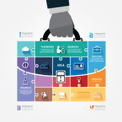
Using Infographics and Charts Adds an Exciting New Dimension To Your Data!
Let’s face it. There’s so much information thrown at people these days it’s impossible to keep up. People are overrun with information overload. There’s no way that all of that data can be retained.
That becomes very bad news when it’s your data, or information about YOUR company or products.
When you put that same data into a chart, or in an infographic however… it becomes monumentally more interesting. You draw people into the content, and most importantly they understand it and remember it! They remember your business.
Your Audience Uses More of Their Brain When Looking at an Infographic or Chart
When you process something visually, 50% of your brain is involved.
That’s a lot of brain power being used on your presentation. When someone is going over a chart or looking over your infographic presentation, they become engaged in your message.
More sensory receptors are being used. Everything literally makes much more sense!
This engagement becomes key when they make decisions.
You Break Through the Clutter of Info Overload
Since charts, graphs, and infographics use illustrations and symbols, your brain processes everything faster. So instead of getting filed away into a ‘process later’ folder…your brain immediately understands the message presented (simply because it’s an easier, faster path).
Ever try to follow directions that didn’t use illustrations? Isn’t it horrible? You’re not alone in that thinking. When people follow directions with illustrations they do 323% better.
Colors are Proven to Increase the Willingness to Read Something by 80%.
 So you’ll grab more attention, gain a larger audience, and that audience retains more of what you’re saying.
How many times have you given a presentation and you felt like your audience walked away without clearly knowing what you were talking about?
You could easily solve that by using charts and infographics to dig right into your audience and prospective customer’s brains.
If you’re ready to start using these tools to increase your leads and customer base, but aren’t really sure where to start…
Or if you just don’t have the time and/or staff to pull these types of effective presentations off…
Click here or Give us a call now at (214) 390-3700 and we’ll help you create brilliant presentations that grab your audience’s attention, and allows them to digest your information quickly!
James Faulkner is SodaPop Media’s Content Manager and Creative Director.
