")
Why Your Website Is Losing Attention (And How Modern Buyers Actually Consume Content)
Why Your Website Is Losing Attention (And How Modern Buyers Actually Consume Content)
Attention has changed — but most corporate websites still behave as if users have unlimited patience.
If your site traffic is “fine” but conversions are slipping, it may not be your offer. It’s how people are consuming content today: faster scanning, higher skepticism, and less patience for friction. The good news: you can fix this without a full redesign — if you know what to change.
1) The Harsh Attention Reality Most Websites Ignore
Modern buyers aren’t reading your website like a brochure. They’re scanning it like a decision tool. They’re looking for proof, clarity, and relevance — quickly.
What’s happening on most corporate websites:
• Visitors skim. They don’t read.
• Relevance is judged in seconds.
• They bounce when it feels like work to understand.
• They don’t trust claims without evidence.

2) How Buyers Really Use Websites (Hint: They Don’t Read)
Most visitors follow predictable patterns:
Headings, bullets, callouts, and visuals do the heavy lifting. If the story isn’t clear at a glance, the page loses.
Buyers want proof fast: recognizable clients, certifications, outcomes, process clarity, and real examples.
Confusing menus, vague buttons, hidden pricing/next steps, or dense content blocks create drop-off.
Clear beats clever. The best websites feel obvious — in the best way.
3) The Content Trap: Why Adding More Copy Backfires
More copy doesn’t equal more persuasion. In many cases, it increases cognitive load and reduces comprehension.
Better approach:
• Lead with the core promise (what you do + for whom).
• Support with proof (outcomes, examples, credibility signals).
• Make next steps effortless (clear CTA and path).
4) Practical Fixes to Capture Attention (Without a Full Redesign)
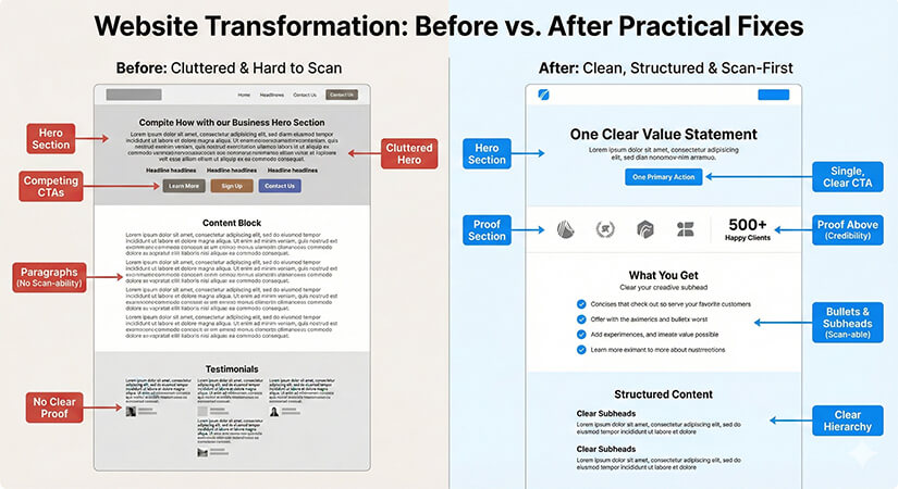
Fast wins (high impact):
✅ Rewrite hero section for clarity (one sentence).
✅ Add proof above the fold (logos, numbers, outcomes).
✅ Convert paragraphs into bullets + subheads.
✅ Add “What you get” section (deliverables, not fluff).
✅ Improve CTA clarity (one primary action).
✅ Reduce distractions (less competing buttons).
A Simple Page Structure That Works
Use this structure on your main pages to support scan-first behavior:
1) Hero: one clear value statement + one CTA
2) Proof: logos, stats, results, testimonials
3) What you do: 3–5 bullets, no jargon
4) How it works: simple process steps
5) Work/examples: show, don’t tell
6) CTA: repeat the single best next step
James Faulkner is SodaPop Media’s Content Manager and Creative Director.
