
The Over-Animation Trap: Designing High-Performance Sites That Convert
The Over-Animation Trap: Designing High-Performance Sites That Convert
We’ve all landed on a modern website that feels less like an informational experience and more like a Hollywood cinematic production. Elements spin into view from the left, background colors flash on scroll, and text fades in with sweeping dramatic timing. It looks beautiful in a design concept review, but for a real user looking for answers, it introduces immediate friction.
As user attention spans compress, the lines between interactive design and performance engineering have blurred. When building business websites, animation should never be treated as decorative ornament. It should be treated as functional communication.
The Golden Rule of Modern Motion
If an animation does not actively help a user understand where to look next or confirm an action they just took, remove it. Decorative motion introduces code bloat and distracts from your core layout conversions.
How to Use Performance-Focused Motion
In our agency R&D labs, we balance immersive visual storytelling with lightning-fast initial load times. Here is how you can use intentional styling hooks to create a conversion-focused experience without slowing things down:
-
Sequence the Entrance Narrative Instead of animating everything at once, utilize targeted sequencing. Ensure the primary hero statement loads instantly, then let supporting feature blocks and action choices fade down with minor, coordinated triggers to naturally guide user vision down the funnel.
-
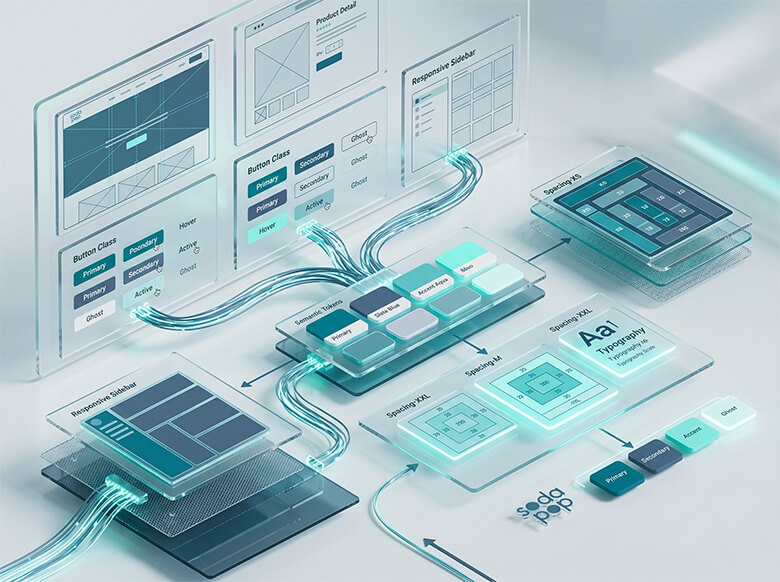
Anchor Styling via Token Architectures Keep your UI lightweight by avoiding massive external animation packages. Map layout transitions cleanly inside lightweight styling frameworks. By controlling layout scales directly from design tokens to clean CSS variables, updates stay efficient and performance-friendly.
-
Protect the Conversion Pathway Form fields, interactive application portals, and primary lead buttons must never suffer from rendering delays. Ensure conversion elements are rock-solid, static indicators or use instantaneous state-changes to keep responses feeling immediate.
Finding Balance in Your Digital Infrastructure
A great website is fundamentally a balance of crisp visuals and uncompromised speed. When you strip out decorative system bloat and focus on deliberate, structural UX animations, you create an environment where your product message gets processed instantly, and your target audience moves smoothly to convert.